Introducing Sydney logo design service – where your brand comes to life!
Are you ready to elevate your business with a standout logo that captures your vision? Look no further—our new logo design service in the Sydney, NSW region is here to bring your brand to life!
A great logo is more than just an image; it’s the face of your business, the first impression, and a lasting symbol of your values. Whether you’re a startup looking to make a splash or an established brand in need of a fresh look, our talented designers are ready to create something unique and memorable just for you.
Why Choose LogoBrain?
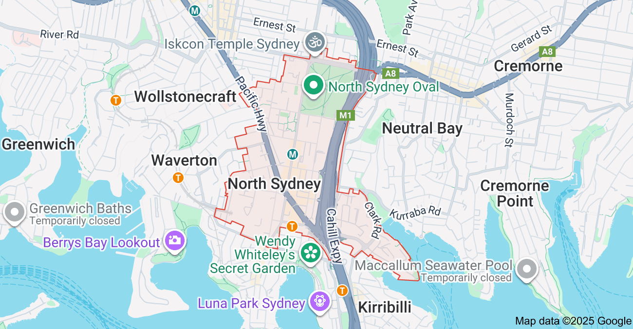
○ Locally focused – We understand the Sydney metropolitan region, its businesses, and the community. Our designs reflect your local identity while making an impact beyond.
○ Custom creations – No generic templates here! Every logo is designed from scratch to match your brand’s personality.
○ Expert senior logo designer – Our team combines creativity with strategy to ensure your logo isn’t just beautiful, but effective in communicating your message.
○ Affordable & accessible – Professional quality at prices that make sense for businesses of all sizes.
Ready to launch your new logo? Call or email us today!
From color choices to typography, we are happy to do all the creative work to ensure your logo represents your brand perfectly. We’re sure you’ll love what we come up with.
Reach out today to get started, and let’s bring your brand’s vision to life in the Sydney metro, New South Wales region and beyond!
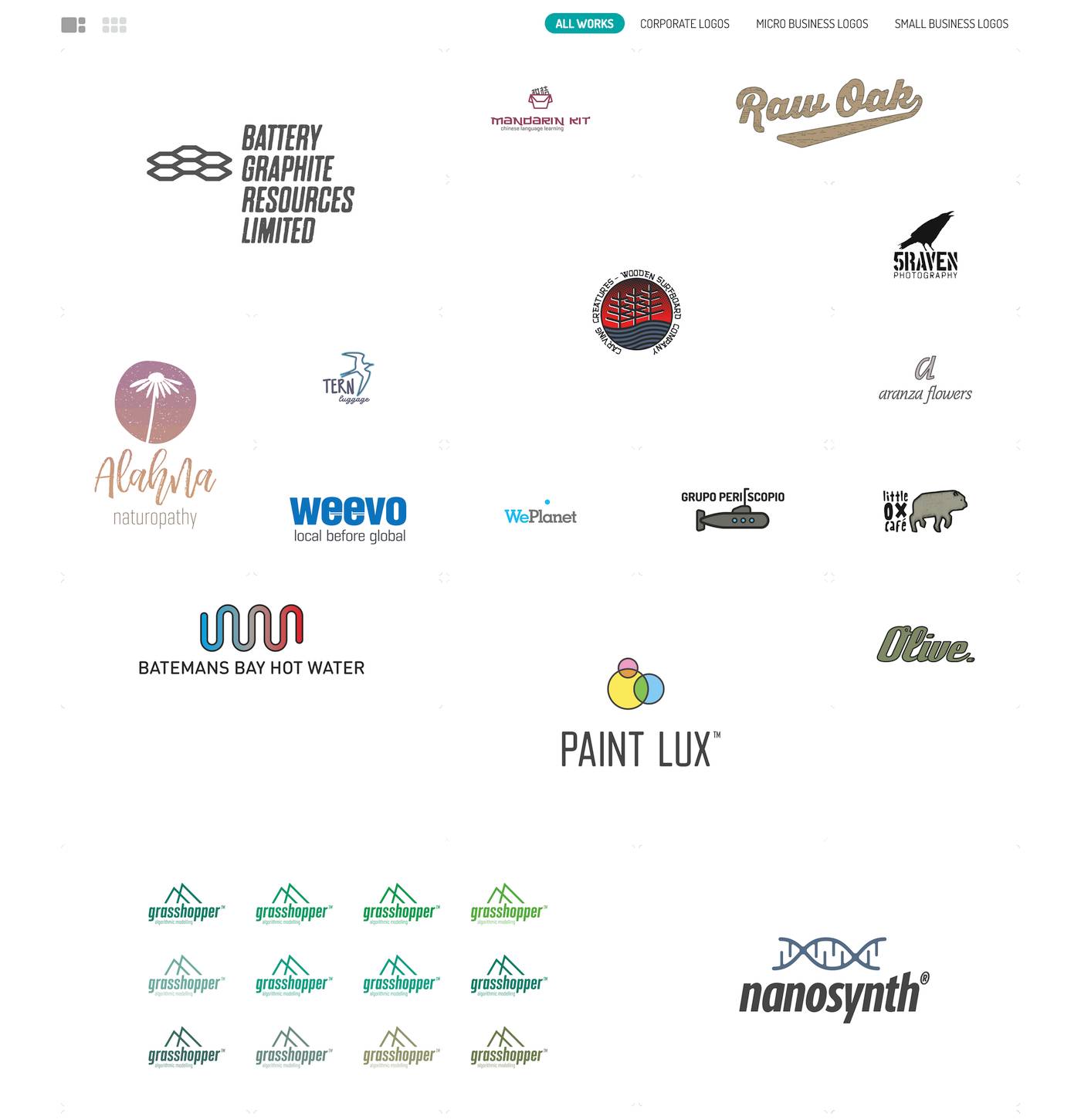
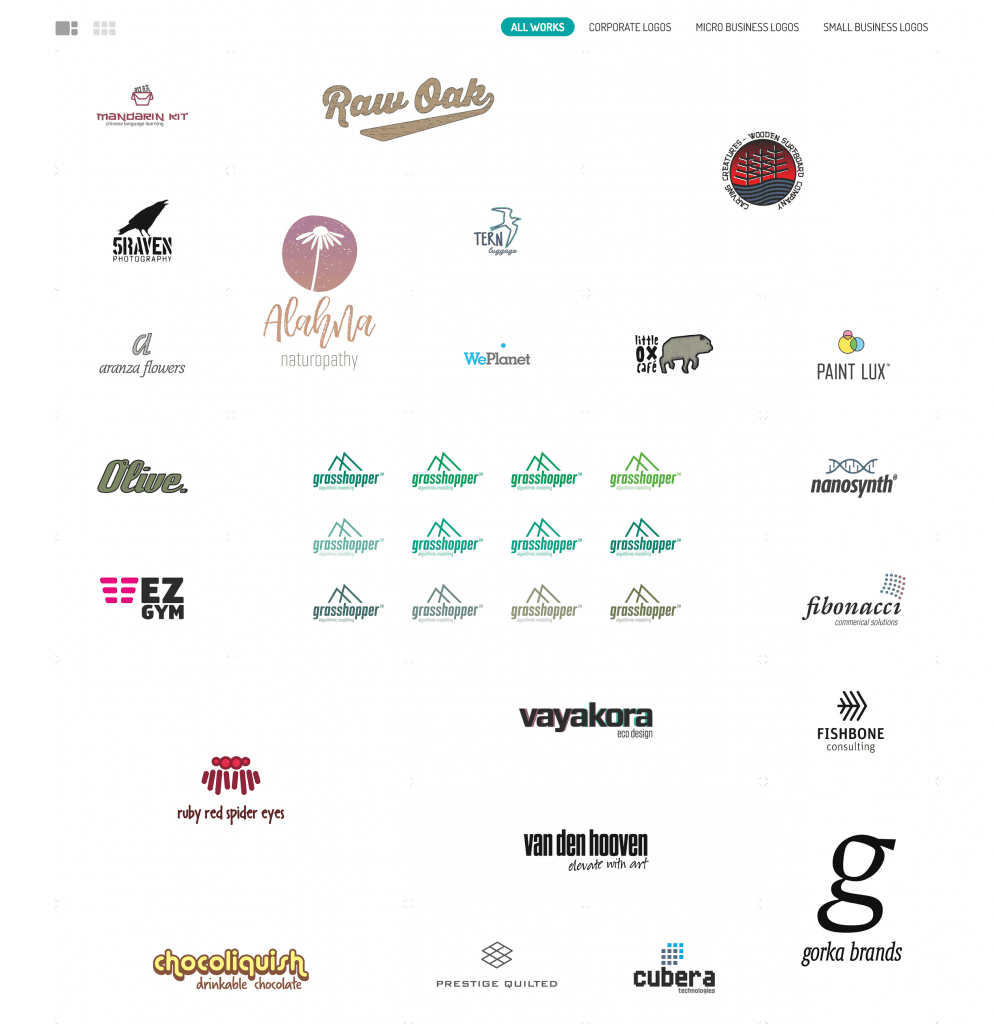
You can view our logo design portfolio here:

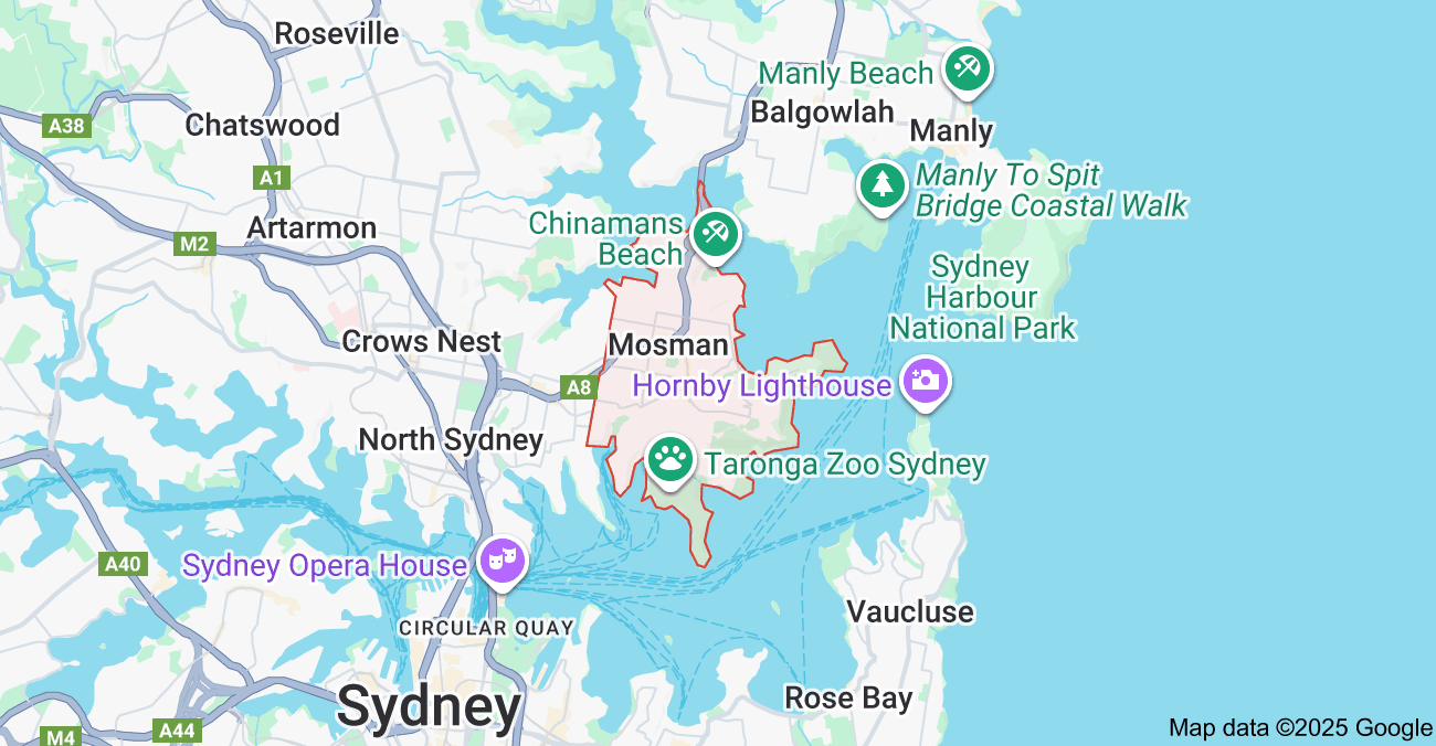
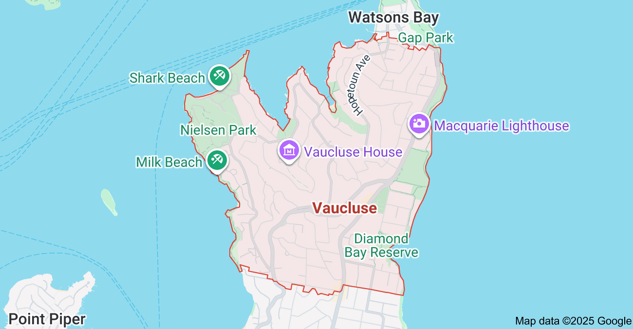
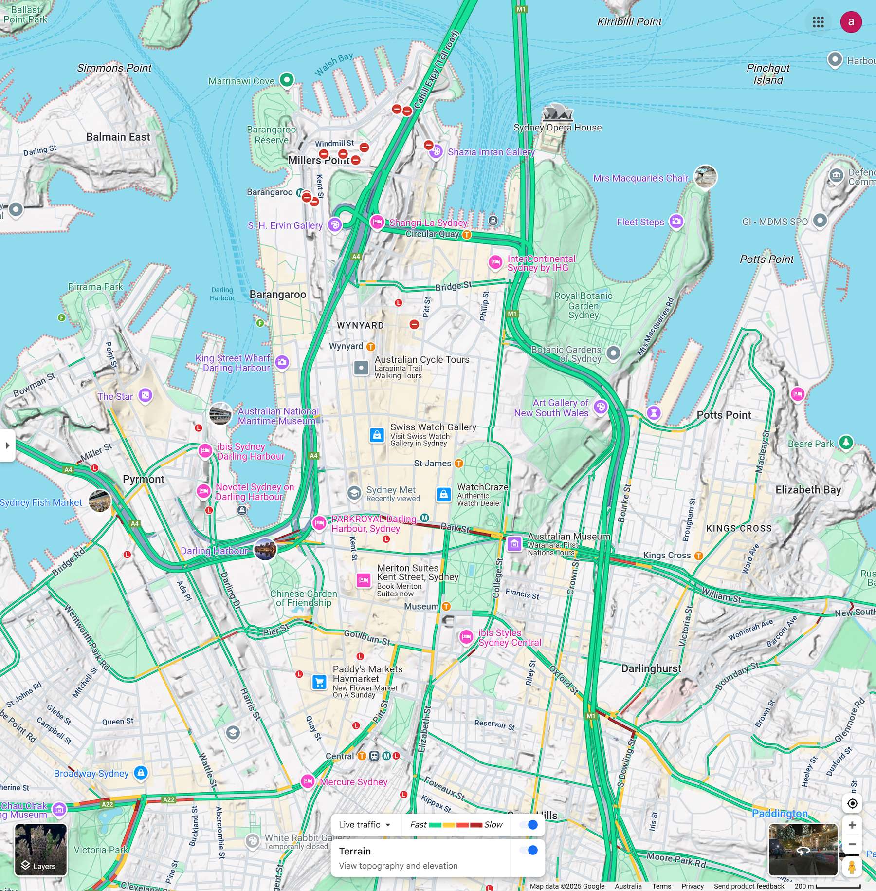
Abbotsbury, Abbotsford, Acacia Gardens, Agnes Banks, Airds, Alexandria, Alfords Point, Allambie Heights, Allawah, Ambarvale,Annandale, Annangrove, Arcadia, Arncliffe, Arndell Park, Artarmon, Ashbury, Ashcroft, Ashfield, Asquith, Auburn, Austral, Avalon Beach, Badgerys Creek, Balgowlah, Balgowlah Heights, Balmain, Balmain East, Bangor, Banksia, Banksmeadow, Bankstown, Bankstown Aerodrome, Barangaroo, Barden Ridge, Bardia, Bardwell Park, Bardwell Valley, Bass Hill, Baulkham Hills, Bayview, Beacon Hill, Beaconsfield, Beaumont Hills, Beauty Point, Beecroft, Belfield, Bella Vista, Bellevue Hill, Belmore, Belrose, Berala, Berkshire Park, Berowra, Berowra Creek, Berowra Heights, Berowra Waters, Berrilee, Beverley Park, Beverly Hills, Bexley, Bexley North, Bidwill, Bilgola Beach, Bilgola Plateau, Birchgrove, Birrong, Blackett, Blacktown, Blair Athol, Blairmount, Blakehurst, Bligh Park, Bondi, Bondi Beach, Bondi Junction, Bonnet Bay, Bonnyrigg, Bonnyrigg Heights, Bossley Park, Botany, Bow, Bowing, Box Hill, Bradbury, Breakfast Point, Brighton-Le-Sands, Bringelly, Bronte, Brooklyn, Brookvale, Bundeena, Bungarribee, Burraneer, Burwood, Burwood Heights, Busby, Cabarita, Cabramatta, Cabramatta West, Caddens, Cambridge Gardens, Cambridge Park, Camellia, Cammeray, Campbelltown, Camperdown, Campsie, Canada Bay, Canley Heights, Canley Vale, Canoelands, Canterbury, Caringbah, Caringbah South, Carlingford, Carlton, Carnes Hill, Carramar, Carss Park, Cartwright, Castle Cove, Castlecrag, Castle Hill, Castlereagh, Casula, Catherine Field, Cattai, Cecil Hills, Cecil Park, Centennial Park, Chatswood, Chatswood West, Cheltenham, Cherrybrook, Chester Hill, Chifley, Chippendale, Chipping Norton, Chiswick, Chullora, Church Point, Claremont Meadows, Clarendon, Clareville, Claymore, Clemton Park, Clontarf, Clovelly, Clyde, Coasters Retreat, Cobbitty, Colebee, Collaroy, Collaroy Plateau, Colyton, Como, Concord, Concord West, Condell Park, Connells Point, Constitution Hill, Coogee, Cottage Point, Cowan, Cranebrook, Cremorne, Cremorne Point, Cromer, Cronulla, Crows Nest, Croydon, Croydon Park, Curl Curl, Currans Hill, Currawong Beach, Daceyville, Dangar Island, Darlinghurst, Darling Point, Darlington, Davidson, Dawes Point, Dean Park, Dee Why, Double Bay, Dover Heights, Drummoyne, Eastgardens, East Killara, East Lindfield, East Sydney, Eastwood, Edgecliff, Elizabeth Bay, Enfield, Epping, Erskineville, Fairfield, Fairlight, Five Dock, Flemington, Forest Lodge, Forestville, Frenchs Forest, Freshwater, Gladesville, Glebe, Glendenning, Gordon, Greenacre, Greenfield Park, Greenwich, Greystanes, Haberfield, Harris Park, Haymarket, Heathcote, Hornsby, Hunters Hill, Hurstville, Ingleburn, Kellyville, Kensington, Kenthurst, Killara, Killarney Heights, Kings Cross, Kingsford, Kirribilli, Kogarah, Kurnell, Lakemba, Lane Cove, Lane Cove North, Lane Cove West, Lansvale, Lavender Bay, Leichhardt, Lewisham, Lidcombe, Lilli Pilli, Lilyfield, Lindfield, Linley Point, Liverpool, Longueville, Lurnea, Macquarie Park, Malabar, Manly, Manly Vale, Maroubra, Marrickville, Mascot, Matraville, McMahons Point, Merrylands, Milsons Point, Minto, Mona Vale, Moore Park, Mortdale, Mosman, Mount Colah, Mount Druitt, Narrabeen, Neutral Bay, Newport, Newtown, Normanhurst, North Bondi, Northbridge, North Cronulla, North Epping, North Manly, North Narrabeen, North Sydney, Northwood, Oatlands, Oatley, Olympic Park, Paddington, Palm Beach, Parramatta, Peakhurst, Peakhurst Heights, Penrith, Penshurst, Petersham, Point Piper, Potts Point, Punchbowl, Pymble, Pyrmont, Quakers Hill, Queenscliff, Randwick, Redfern, Revesby, Rhodes, Rockdale, Rose Bay, Roseville, Roseville Chase, Rozelle, Rushcutters Bay, Ryde, Seaforth, Seven Hills, Stanwell Tops, St Ives, St Leonards, Strathfield, Summer Hill, Surry Hills, Sutherland, Sydenham, Sydney, Sydney CBD, Sydney city, Sydney NSW, Tamarama, Tempe, Tennyson Point, Terrey Hills, The Rocks, Thornleigh, Turramurra, Ultimo, Vaucluse, Wahroonga, Waitara, Wakehurst, Warrawee, Warriewood, Waterloo, Watsons Bay, Waverley, Waverton, Wentworth Point, Westmead, Whale Beach, Willoughby, Wolli Creek, Wollstonecraft, Woollahra, Woolloomooloo, Woolwich, Woronora, Yagoona, Yennora,
