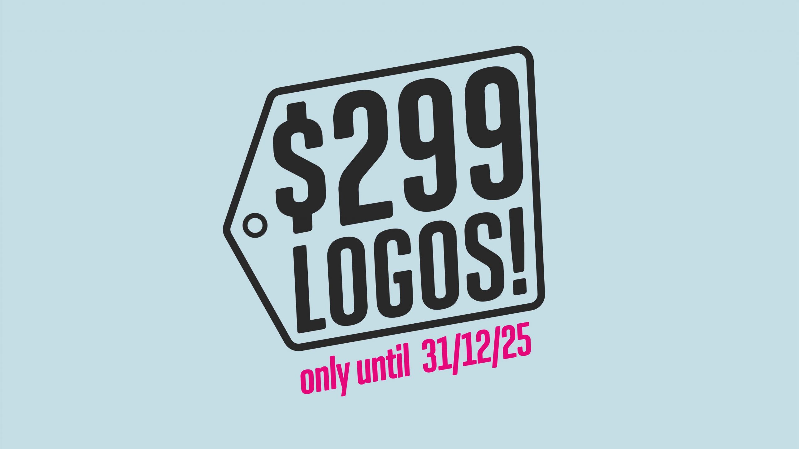
Limited time special offer: $299 logo design!
In today’s competitive market, a strong brand identity is more important than ever. Your logo is the face of your business—it’s the first thing customers notice and the lasting impression they carry. A well-designed logo communicates professionalism, trust, and imparts character & personality to your brand, setting you apart from the competition. But we get it: high-quality design can feel out of reach for small businesses, startups, or entrepreneurs on a budget, especially with the recent cost of living crisis.
That’s why we’re thrilled to announce our limited-time special offer: a professional customised logo design for just $299 — a rare opportunity to access our professional branding experience at a very accessible price.
Your logo is more than just a pretty image—it’s a storytelling tool. It conveys your brand’s values, personality, and mission in a single glance. Whether you’re launching a new business, rebranding, or refreshing your look, a custom logo is a critical investment in your success.
Studies show that 75% of consumers judge a company’s credibility based on its visual design. It takes just 17 to 50 milliseconds—less than the blink of an eye—for people to form an initial impression of a visual design, including a logo. That snap judgment is shaped by factors like color, symmetry, typography, and how familiar or unique the design feels within its category. Don’t let an outdated or generic logo hold you back!
Whether you’re launching a new venture, refreshing your visual identity, or finally giving your side hustle the professional polish it deserves, this offer is designed to meet you where you are.
A professional logo is an investment that pays dividends for years to come. Don’t settle for a generic, cookie-cutter design from a free logo maker—your brand deserves better. With our limited-time $299 logo design offer, you can get a custom, high-quality logo that elevates your business without breaking the bank.
Act now to secure your spot and transform your brand today — this offer ends on the 31st of December 2025!
We’re also very proud to offer online consultations and creative meetings to clients beyond the Eurobodalla region, ensuring that distance is never a barrier to meaningful collaboration. Whether you’re based in a city, a coastal town, or halfway across the globe, our virtual sessions are designed to be just as immersive and tailored as in-person meetings.
Have questions? Call Leslie directly on +61 497 889 998 or email us at info@logobrain.design — we’re here to help your brand reach new heights.
