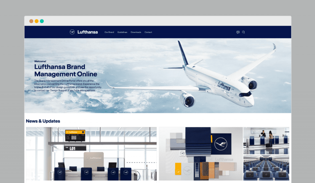
Here are the Lufthansa logo guidelines for example. Guidelines for the use of icons. Illustration guidelines. More technical illustration guidelines. Infographics guidelines. Then they have a colour style manual. A typeface and typography guidelines. Interior, product and industrial design brand guidelines. Motion design guidelines.
All of this creates a unified brand so that Lufthansa Group’s 110,065 employees have an identical vision.
But it’s not just Lufthansa. It’s Qantas. British Airways. Starbucks. Uber. NASA. Twitter. Switzerland has a style guide. Al Jazeera has a style guide. The London underground has a style guide. Sony has a style guide. Ericsson has a style guide. 3M has brand guidelines. Microsoft has a style guide.
